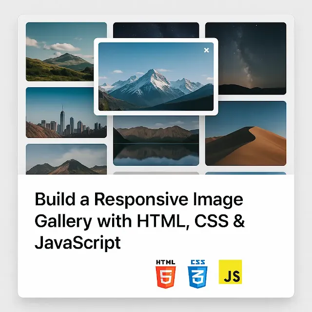
Want to create a clean, responsive image gallery that looks great on any device and works with lightbox-style interaction? You're in the right place!
In today’s tutorial, you’ll build a modern, responsive image gallery with hover effects and a click-to-expand modal using nothing but HTML, CSS, and JavaScript — no libraries, no dependencies.
This project is perfect for beginners and great for your portfolio or freelance work.
🔧 What You'll Learn
- How to structure a responsive gallery layout in HTML
- How to style it with modern CSS (including hover effects)
- How to use JavaScript to create a modal/lightbox feature
🧱 Step 1: Basic HTML Structure
We'll start with a simple grid layout containing a few images.
<div class="gallery">
  <img src="image1.jpg" alt="Gallery Image 1" />
  <img src="image2.jpg" alt="Gallery Image 2" />
  <img src="image3.jpg" alt="Gallery Image 3" />
  <img src="image4.jpg" alt="Gallery Image 4" />
</div>
🔍 Explanation:
- The
.gallerycontainer holds all the images. - Each image will eventually be styled into a responsive grid layout.
- Replace
image1.jpg,image2.jpg, etc. with real image paths or URLs.
🎨 Step 2: CSS Grid + Hover Effects
Let’s add styling to create a grid layout and subtle hover animations.
.gallery {
  display: grid;
  grid-template-columns: repeat(auto-fit, minmax(250px, 1fr));
  gap: 15px;
  padding: 20px;
}

.gallery img {
  width: 100%;
  height: auto;
  cursor: pointer;
  transition: transform 0.3s ease;
  border-radius: 8px;
}

.gallery img:hover {
  transform: scale(1.05);
}
💡 What’s Happening:
- The grid layout is responsive — it adapts based on screen size.
- Each image gets a hover zoom effect and rounded corners.
- The
cursor: pointerhint prepares us for modal functionality.
💡 Step 3: Add the Modal HTML
Now we’ll create a hidden modal that will show the clicked image.
<div id="modal" class="modal">
<span id="close">×</span>
<img id="modal-img" src="" alt="Full View" />
</div>
🧠 Explanation:
#modalis initially hidden.#modal-imgwill be updated dynamically with JavaScript.- The close
×allows users to dismiss the full view.
🖼️ Step 4: Style the Modal with CSS
We’ll now add styling to make the modal cover the screen and center the image.
.modal {
  display: none;
  position: fixed;
  z-index: 999;
  left: 0;
  top: 0;
  width: 100%;
  height: 100%;
  background: rgba(0, 0, 0, 0.8);
  justify-content: center;
  align-items: center;
}

.modal img {
  max-width: 90%;
  max-height: 80%;
  border-radius: 10px;
}

#close {
  position: absolute;
  top: 20px;
  right: 30px;
  font-size: 2rem;
  color: white;
  cursor: pointer;
}
⚙️ Step 5: JavaScript to Open & Close the Modal
Here’s how you’ll make the modal work with plain JavaScript.
const galleryImages = document.querySelectorAll('.gallery img');
const modal = document.getElementById('modal');
const modalImg = document.getElementById('modal-img');
const closeBtn = document.getElementById('close');

galleryImages.forEach((img) => {
  img.addEventListener('click', () => {
    modal.style.display = 'flex';
    modalImg.src = img.src;
  });
});

closeBtn.addEventListener('click', () => {
  modal.style.display = 'none';
});

window.addEventListener('click', (e) => {
  if (e.target === modal) {
    modal.style.display = 'none';
  }
});
✅ Explanation:
- Clicking an image sets the modal image and shows it.
- Clicking the close button or outside the image closes the modal.
- Simple, clean, and effective!
🔗 Combine All Snippets
To see the full gallery in action, just combine the HTML, CSS, and JavaScript snippets above into one project. You can put the CSS in a <style> block or external file, and the JavaScript in a <script> tag at the bottom of your HTML or in a separate JS file.
💡 Best Practices
- Use lazy loading (
loading="lazy") on images to improve performance. - Optimize image sizes before uploading.
- Use
alttext on images for SEO and accessibility. - Consider using real image hosting (like Cloudinary or Imgur for demos).
📈 SEO & UX Impact
A responsive image gallery improves user experience, encourages longer site visits, and enhances visual storytelling — all of which are great for SEO and content engagement.
✅ Conclusion
You just built a responsive image gallery with HTML, CSS, and JavaScript — no libraries needed! This is a great addition to your portfolio and a nice module to include in larger projects.
🎯 Want more frontend projects like this? Check out our tutorials under the frontend-lab and projects categories!


0 Comments