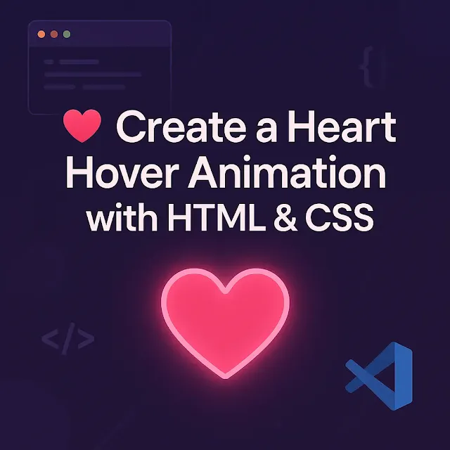
Ever wanted to create a delightful hover animation that reacts beautifully when users interact with it? In this beginner-friendly tutorial, you’ll learn how to build an animated heart icon using only HTML and CSS — no JavaScript required!
By the end, you'll have a smooth, interactive visual that's perfect for websites, portfolios, or Valentine’s projects. Let’s dive in, one snippet at a time.
🧱 Step 1: The Basic HTML Structure
We’ll begin with a simple HTML boilerplate. This sets up the foundation for our animation.
<!DOCTYPE html>
<html lang="en">

<head>
    <meta charset="UTF-8">
    <meta name="viewport" content="width=device-width, initial-scale=1.0">
    <title>Heart Animation - Tech Talker 360</title>
</head>

<body>
    <!-- Animation goes here -->
</body>

</html>
✅ Explanation:
<!DOCTYPE html>tells the browser we’re using HTML5.<meta name="viewport">ensures the layout works well on mobile.- The
<title>helps with SEO and shows up on the browser tab.
🎨 Step 2: Embedding the Heart SVG Icons
We’ll place two heart-shaped SVGs inside a <div class="icon">. One SVG will animate on hover, the other creates a glowing background effect.
<div class="icon">
    <svg class="heart-main" viewBox="0 0 512 512" width="100" title="heart">
        <path
            d="M462.3 62.6C407.5 15.9 326 24.3 275.7 76.2L256 96.5l-19.7-20.3C186.1 24.3 104.5 15.9 49.7 62.6c-62.8 53.6-66.1 149.8-9.9 207.9l193.5 199.8c12.5 12.9 32.8 12.9 45.3 0l193.5-199.8c56.3-58.1 53-154.3-9.8-207.9z" />
    </svg>
    <svg class="heart-background" viewBox="0 0 512 512" width="100" title="heart">
        <path
            d="M462.3 62.6C407.5 15.9 326 24.3 275.7 76.2L256 96.5l-19.7-20.3C186.1 24.3 104.5 15.9 49.7 62.6c-62.8 53.6-66.1 149.8-9.9 207.9l193.5 199.8c12.5 12.9 32.8 12.9 45.3 0l193.5-199.8c56.3-58.1 53-154.3-9.8-207.9z" />
    </svg>
</div>
✅ Explanation:
- Both SVGs use the same heart path.
- The
.heart-mainelement will handle the stroke-drawing animation. - The
.heart-backgroundwill handle the scaling + fading behind it for a cool glow.
🖌️ Step 3: Styling the Page with CSS
Let’s begin styling with a font, background color, and layout using CSS.
@charset "utf-8";

/* CSS Document */
@import url('https://fonts.googleapis.com/css?family=Sofia');

* {
    margin: 0;
    padding: 0;
    box-sizing: border-box;
    font-family: 'Sofia', sans-serif;
}

*::before,
*::after {
    box-sizing: border-box;
}

:root {
  --pink-light: #e0699b;
  --pink: #e41e70;
}

body {
  height: 100vh;
  display: grid;
  justify-content: center;
  align-items: center;
  background: #31065a;
  font-family: 'Sofia', sans-serif;
}
✅ Explanation:
- We're using CSS variables (
--pink,--pink-light) for easy reuse. - The
gridlayout vertically and horizontally centers the heart. - A dark background makes the pink animation pop!
🔄 Step 4: Heart SVG Styling and Hover Animations
Now let’s animate the heart with stroke-drawing and scale effects on hover.
.icon {
  fill: transparent;
  stroke: var(--pink);
  stroke-width: 25;
  cursor: pointer;
  position: relative;
}

.icon svg {
  overflow: visible;
  width: 15rem;
}

.icon path {
  stroke-dasharray: 1550;
  stroke-dashoffset: 0;
  transform-origin: center;
}
✅ Explanation:
stroke-dasharrayandstroke-dashoffsetlet us animate the stroke path as if it’s being drawn.overflow: visibleensures the growing heart isn’t clipped.- We use
transform-origin: centerfor scaling animations to stay centered.
✨ Step 5: Adding the Hover Animation
Now for the magic — we animate the stroke and scale using CSS @keyframes.
.icon .heart-background {
    position: absolute;
    left: 0;
    right: 0;
    z-index: -1;
    stroke: none;
}

.icon .heart-main:hover path {
  animation: stroke-ani 5s ease-in-out forwards;
}

.icon .heart-main:hover ~ .heart-background path {
  animation: fade-ani 5s ease-in-out forwards;
}
✅ Explanation:
When you hover over
.heart-main, it triggers:- a stroke animation on the front heart.
- a fading/glowing animation on the background heart.
🎬 Step 6: Defining the Keyframe Animations
Let’s define the actual keyframe sequences for the hover animations.
@keyframes stroke-ani {
    0% {
        stroke-dashoffset: 10;
    }

    30% {
        stroke-dashoffset: 1600;
    }

    60% {
        stroke-dashoffset: 3100;
        fill: transparent;
        transform: scale(1);
    }

    80% {
        fill: var(--pink);
        transform: scale(1.5);
    }

    90% {
        transform: scale(2);
    }

    100% {
        stroke-dashoffset: 3100;
        fill: var(--pink);
    }
}
🔹 Snippet #7: Background Fade Animation
@keyframes fade-ani {
    70% {
        fill: transparent;
        transform: scale(1.5);
    }

    80% {
        fill: var(--pink-light);
        transform: scale(2);
        opacity: 1;
    }

    90% {
        opacity: 1;
    }

    100% {
        transform: scale(3);
        opacity: 0;
    }
}
✅ Explanation:
stroke-anicreates a drawing + growing effect.fade-anigives a soft glow burst, then fades out for a subtle touch.
📦 Putting It All Together
Once you combine all the snippets above, you’ll get a beautiful, interactive heart icon that animates on hover. 🫶
💡 Note: To see the full result, simply combine the HTML and CSS snippets into one
.htmlfile and open it in your browser.
💡 Best Practices & Tips
- Use SVGs over image icons for scalable and crisp animations.
- Keep animations lightweight for better performance.
- Use
:rootvariables to easily adjust themes or add dark mode.
🔍 SEO & Performance Insights
Smooth CSS animations improve user engagement and time on page — both important SEO factors. Plus, lightweight animations using SVGs help maintain fast page load speeds, which Google loves!
✅ Conclusion
With just HTML and CSS, you've created a fun, interactive heart animation that brings personality to your web projects. Try customizing the color, shape, or animation timing to make it your own!
👉 Ready to level up? Check out our other CSS animation tutorials or explore JavaScript-based interaction guides on Tech Talker 360.
Have questions or want to share your version? Drop a comment or tag us on social media! 💬


0 Comments